Your NetSuite dashboard is the first thing users see when they log in. By default, it is a collection of generic portlets that provide little actionable insight. But with thoughtful customization, the dashboard becomes a real-time financial command center that surfaces the metrics that matter, highlights exceptions that need attention, and drives data-informed decision-making across the organization. In this guide, we show you how to optimize NetSuite dashboards for maximum impact.
Understanding NetSuite Dashboard Architecture
Before diving into specific optimizations, it is important to understand how NetSuite dashboards work:
- Role-based dashboards: Each NetSuite role (Administrator, CFO, Controller, Sales Rep, etc.) has its own default dashboard. When a user logs in, they see the dashboard for their assigned role.
- Standard vs. custom dashboards: NetSuite provides standard dashboards for each role, but administrators can create custom dashboards and assign them to roles.
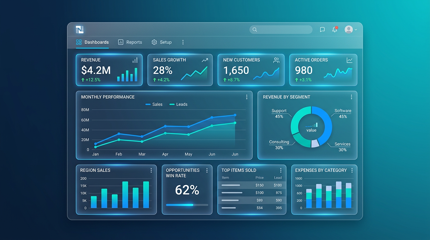
- Portlets: Dashboards are composed of portlets — individual widgets that display different types of content. NetSuite supports several portlet types: KPI, KPI Meter, Trend Graph, Custom Search, List, Shortcut, Calendar, and Custom Portlet (SuiteScript-powered).
- Personal vs. published: Users can personalize their own dashboards, or administrators can publish dashboards that are shared across all users of a role.
Selecting the Right KPIs
The most critical decision in dashboard design is choosing which KPIs to display. Too few and the dashboard lacks value. Too many and users suffer from information overload. Follow the rule of seven: no more than seven primary KPIs per dashboard.
KPIs for the CFO Dashboard
- Revenue (MTD/QTD/YTD): Total recognized revenue with comparison to budget and prior year.
- Gross Margin %: Revenue minus COGS as a percentage — the single most important profitability metric.
- EBITDA: Earnings before interest, taxes, depreciation, and amortization.
- Cash Position: Current bank balances plus short-term investments minus upcoming AP obligations.
- Days Sales Outstanding (DSO): How quickly customers pay — a leading indicator of cash flow health.
- Burn Rate / Runway: For venture-backed companies — monthly cash burn and months of runway remaining.
- Revenue per Employee: A measure of organizational efficiency and scalability.
KPIs for the Controller Dashboard
- Close Progress: A checklist portlet showing the status of each month-end close task.
- Unposted Journal Entries: Count of journal entries awaiting approval or posting.
- Bank Reconciliation Status: Which accounts are reconciled and which are outstanding.
- AP Aging: Vendor bills by aging bucket (current, 30, 60, 90+ days).
- AR Aging: Customer invoices by aging bucket with overdue amounts highlighted.
- Intercompany Balances: Net IC balances that need to be eliminated at period-end.
KPIs for Sales Management
- Pipeline Value: Total weighted pipeline by stage.
- Win Rate: Percentage of opportunities that convert to closed-won.
- Average Deal Size: Mean revenue per closed deal.
- Sales by Rep: Leaderboard showing quota attainment by sales rep.
- New Customers This Month: Count and value of new customer acquisitions.
Building Saved Searches as Dashboard Data Sources
Saved searches are the engine behind most dashboard portlets. A well-designed saved search can power KPI calculations, trend graphs, and list portlets. Here are best practices for building dashboard-ready saved searches:
Performance Optimization
- Limit result columns: Only include the columns you need for the portlet. Extra columns slow down the search.
- Use summary types: For KPI calculations, use summary (grouped) searches that return a single row with the aggregated value, rather than detail searches that return every record.
- Filter aggressively: Date ranges, status filters, and subsidiary filters reduce the data set and improve load time.
- Avoid formula fields where possible: Formula fields are calculated at runtime and can slow searches significantly. If you need complex calculations, consider a custom field with a SuiteScript workflow to pre-compute the value.
Trend Data
For trend graph portlets, create saved searches that group by period (month, quarter) and return the metric value for each period. The portlet will automatically render this as a line or bar chart. Include at least 6 periods of historical data for a meaningful trend view.
Portlet Configuration Tips
KPI Portlets
KPI portlets display a single number with optional comparison to a prior period, budget, or target. Configure the comparison to show percentage change — this gives users instant context on whether the number is good, bad, or neutral.
KPI Meter Portlets
KPI Meters display a gauge (like a speedometer) that shows where a metric falls relative to a range. Use these for metrics with clear targets — for example, a gross margin meter with green (above 45%), yellow (35–45%), and red (below 35%) zones.
Custom Search Portlets
Custom search portlets display the results of a saved search as a table within the dashboard. Use these for lists that require user interaction — overdue invoices (click to view the invoice), open POs awaiting approval (click to approve), or items below reorder point (click to create a PO).
Trend Graph Portlets
Display metrics over time as line, bar, or area charts. Best for revenue trends, expense trends, headcount growth, or any metric where the direction of change matters more than the absolute value.
Role-Based Dashboard Design
The cardinal sin of dashboard design is giving everyone the same dashboard. Different roles have different information needs, and the dashboard should reflect that. Here is a practical approach:
- List every role in your NetSuite instance.
- For each role, identify the 5–7 most important metrics and the 3–5 most important lists.
- Build the saved searches and KPIs for each role.
- Assemble role-specific dashboards using the appropriate portlets.
- Publish the dashboards to each role.
- Solicit feedback from users and iterate.
Advanced Dashboard Techniques
SuiteScript Custom Portlets
For visualizations or data presentations that standard portlets cannot achieve, SuiteScript Portlet scripts allow you to write custom HTML, CSS, and JavaScript within a dashboard portlet. This is useful for custom charts (powered by Chart.js or D3.js), embedded external dashboards, or interactive data displays.
SuiteAnalytics Workbooks
NetSuite's SuiteAnalytics Workbooks provide a more sophisticated analytics layer with pivot tables, custom chart types, and the ability to join multiple data sets. Workbooks can be published to dashboards as portlets, giving users BI-level analytics without leaving NetSuite.
How YRK Consulting Can Help
Dashboard optimization is a core part of our Optimization services. We work with your leadership team to identify the metrics that matter, build the saved searches and KPIs to power them, design role-based dashboards, and train your team to maintain and evolve them over time. A well-designed dashboard pays for itself in better decisions, faster close, and reduced time spent pulling reports manually.
Contact us for a dashboard optimization workshop.